
If you’re designing interfaces for websites and apps, it’s still mostly about words.
Iterating quickly without considering the words is like forgetting to add yeast to the dough. You’re leaving out one of the most crucial ingredients that actually make your interface work.
I’ve written previously about how copy is interface. Once people have downloaded your app, for example, words direct them and create paths for them to follow. If consistency is one of the key rules of building a great user interface, words should be part of the equation, not just recurring UI design patterns. Words bring clarity to the layout, button icons, and graphics.
Obviously my thoughts are less than perfect versions of ideas that other, more accomplished people have spoken about at length. My aim here is to explore how I might apply interface copy to design better products.
Below, I will show you how microcopy can anticipate friction in the user flow, make your product more helpful, and create stronger connection with users.
Craft microcopy that reads people’s mind
Timely copy anticipates users’ needs and actions. Microcopy works because it answers a very specific question people have and address their concerns right on the spot. It almost takes the thoughts straight out of people’s head.
If you blog, do you remember your sign up experience? These were some of the thoughts that went through my head:
- I need to come up with a perfect URL for my blog!
- What if I choose a URL and I don’t like it after I sign up? Do I have to sign up again just to start a new blog?
- This is so stressful. I don’t know which one to choose. Maybe I should just wait until later.
I signed up for Tumblr in 2009, and I remember trying to come up with a clever name/URL that represented what I want to write about. Tumblr has evolved much since then, including inserting a tiny string of text to help users like me:

See the “you can change this at any time” microcopy?
Tumblr noticed these voices in users’ head, and they inserted microcopy to ease such fears during sign up. This is just a glimpse of the power a well-placed microcopy can have.
People have their own opinions, preferences, values, and beliefs. They bring all of that with them when they visit your website or open your app. What situation are they in when they use your product? Using Tumblr as an example, look at a user’s arrival on the sign up page as a part of a larger story. Ask yourself these questions (adapted from Nicely Said):
- What is the user trying to do?
- What could the user be feeling?
- How did the user get here?
- What’s happening next?
- What choices can they make?
Once you get a bearing on the bigger picture, think about the conversation you want to have with them. How would you guide them through the sign up process as if you were doing it in person? Write down the actions a user would take and the words you would use to describe the process.
If the user needs to make a decision, like deciding on the blog URL, how can the interface clarify it? Is what you’re asking them to do confusing or overwhelming? Are you setting clear expectations? Is there something the user needs to hear to boost their confidence?
One way to test your copy is to pay attention to the actual words people use during usability study sessions. Take notes on the phrases participants use to describe their actions. Do they adopt the texts you wrote to describe what they are doing and seeing?
This is an exercise in empathy. Carefully chosen words act like a sign post or a tour guide that help people reach their goals. Pay close attention to these little details to ensure that people feel understood. Show you’ve thought through the product experience from beginning to end.
Create thoughtful moments with responsive copy
Delight is often brought on by an unexpected, yet positive, turn of events. I would describe it as a mix of joy and surprise.
Since technology disappoint people all the time, how might you brighten their day? Copy can delight when it shows up after someone takes an action or interact with your website. I call it responsive copy because it’s dynamic, and the words should fit the situation like a glove.
Take for example this interaction on Instagram. When you’re scrolling through the app, you see mostly photos. Sometimes, a video would pop up in the feed. Although the little animation in the top-right corner lets you know that it’s a video, it’s not always obvious that it has sound. Since I usually leave my phone on vibrate, I do what this user does when I come across a video: I turn up the volume.

Thanks for letting me know, buddy. (Source: Little Big Details)
Instagram crafted contextual copy to let me know when a video has no sound. How nice of them! Instead of wondering if there’s something wrong with my phone, or if the video has really low volume, Instagram just tells me on the spot what I want to know. This is the level of thoughtfulness an app should strive for.
I also love how Dropbox talks to me. Just take a look at their instructional copy.

Clear, concise, and easy to understand. It’s like a Zen master speaking. (Source: Little Big Details)
When you try to enter your password, it gives you helpful and relevant instructions to support your task. Let’s break it down a bit further:
- “Good passwords are hard to guess.” – Duh. But this sets the expectation for what I should strive towards.
- “Use uncommon words or inside jokes…” – It gives me tips on what to do. It’s being prescriptive, not only descriptive.
- ‘uPPercasing’ and ‘creative spellllling’ – It doesn’t just tell me what to do; it shows me how to do it.
I can tell people at Dropbox thought through how someone might actually create a password. By providing useful, relevant help text, it lowers chances that people might feel frustrated and confused, while also preventing potential errors.
Short copy is often the hardest to write. Because responsive copy is designed to be triggered, it might also annoy and distract people from their tasks. Strive to be invisible. Here are a few things to keep in mind:
- Get to the point. Since these texts only appear for a second or two, it needs to be concise and relevant. Be straightforward but friendly.
- Be clear without being overwhelming. Say only as much as needed. Leave humor and personality out if the situation is potentially frustrating or stressful.
- Don’t assume people know how to do things. But avoid insulting people’s intelligence, too.
- Use positive and encouraging tone. Check cutesy and flowery language at the (metaphorical) door. But overly formal language can make people uncomfortable.
When you’ve got only a moment to delight, the stakes are high. But carefully chosen words will lend your product a sense of quality. And placing helpful text in the right place at the right time can create trust.
Sensitive microcopy doesn’t have to be dull
Error messaging isn’t the easiest copy to write. Not only do you need to communicate how to fix the error, you also have write for the emotions. From working in a few customer service roles, I learned that timing and tone are crucial for defusing tense situations.
But you don’t have to be serious all the time. In non-critical situations, it may be appropriate to show a little personality. Just use it sparingly. Transitions and notifications are a good place for this.
Mailchimp is a poster child for writing copy that matches users’ emotions. In the error copy below, it lets the user know what happened in plain language. The message also injects a little comic relief, but it doesn’t annoy or go overboard.
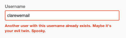
What’s the fewest words you need to make me LOL? (Source: Little Big Details)
Yelp shows that an error doesn’t have to be disappointing, too. Notice that the Retry button provides another option so this user flow isn’t a dead end.

Got a little chuckle out of an otherwise disappointing search result. A chuckle or a smirk is a pretty good reaction. (Source: Little Big Details)
If you rather not risk angering users, find opportunities to let loose during transitions and wait times. Usually, people aren’t being productive and might be trying to get the product to work. It’s pretty safe to engage users in a fun, playful way.
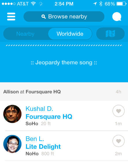
That theme song is bound to get stuck in my head now. Transition copy written by Allison Esposito.
It’s nice to see a little bit of Foursquare’s personality, thanks to Allison. Otherwise, it might seem like just another location-based search service. Speaking of which, you can now use emojis to search for businesses on Yelp. These kinds of experiences could differentiate your product, strengthen your brand voice, and give your product a human touch.
I’ve shown you a few examples of where you can be playful in your error messaging. Most of the time, though, it’s best to be straightforward. Here are several things to keep in mind as you craft error messages:
- Own the apology. Say what you’re sorry for, but avoid being overly apologetic. Focus on fixing the mistake.
- Get to the point. Spell out what happened, and what you will do next. If something is required of the user, be direct about what they need to do and say why.
- Be as transparent as possible. Be honest about what is happening. Update people on the progress as you go, or give time estimate for when the issue will be resolved.
- Avoid words like error, failure, invalid, and terminate. Don’t use alert, immediately, and urgent unless it’s absolutely necessary.
- Don’t blame the user. It’s not nice to make people feel bad.
Think about the person on the other side of the screen. Who are they, and what do they need to hear from you? If you wouldn’t naturally say it out loud, go back and revise it. Keep working at it until the copy feels natural.
What do you want to be remembered for?
One of my favorite quote is from Maya Angelou:
“I’ve learned that people will forget what you said, people will forget what you did, but people will never forget how you made them feel.”
Words have a capacity to make people feel something. When words are as removed from people as they are on an interface, it’s easy to discount all the small copy tucked away under form fields, hidden behind interactions, and pop up only to announce something unpleasant.
But these little details add up over time. People notice them. As Maya Angelou said, words may be inconsequential but the feelings from them are remembered for a long time.
At the end of the day, your copy should help your users and customers live a better life. That’s how you show you care about them.
Resources
Want to learn more about microcopy? I’ve put together a short list of places where you can dive in.
- Principles of User Interface Design (Joshua Porter)
- 5 Rules For Writing Great Interface Copy (Fast Company)
- Microcopy: Tiny Words That Make A Huge Impact On Conversions (ConversionXL)
- The craft of words. Part two: microcopy (book)
- UI is Communication (book)
- Nicely Said (book)
